lets talk about sex
easier than google, [safer] than porn
reimagining inclusive teen access to sexual health education
Let’s talk about sex.
The modern teen has a world of information at their fingertips, and the classroom hasn’t quite caught up with the inclusive, informative, and accurate information about sexual health. It’s no wonder they turn toward google and porn to try and fill the gaps. Teensource.com is a promising source for all-things-sex-ed, but myself and four fellow designers saw an opportunity to make it even better.
““ the only thing i learned in sex ed was how to use a condom “”
user research
We began with an exhaustive survey to determine inclusivity and informativeness of sex-ed. Our goal was to establish a wholistic view of how teensource might fit into the sex-ed landscape. We learned overwhelmingly that sex-ed in school is exclusive, uninformative, and awkward. More often than not, teens turn toward google or porn to learn about sex. This is dangerous, as this could disseminate unsafe information and lead to poor sexual health choices. Therefore, we landed on the problem statement for teensource to pursue: how might we create a website that is easier than google, better than porn, and provides safe and accurate health advice no matter who you are or who you love?
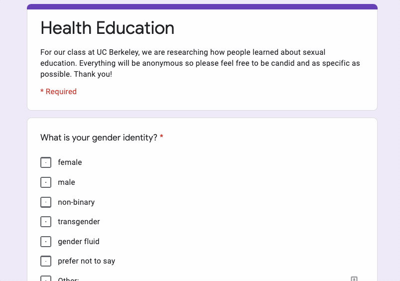
user survey created with google forms

initial user test results with original website

Empathy map of our persona, Dominque, a teen struggling with her sexuality and how to make safe choices.
the strategizing
using our survey results, we established three important user paths throughout the information on the website. we tested those as 3 tasks with 5 users, and found out that a main gap in the usability of the website was the information architecture.


we went through several card sorts to establish a structure that would serve the main reasons teens need to visit the site (as established in our survey), while maintaining simplicity.
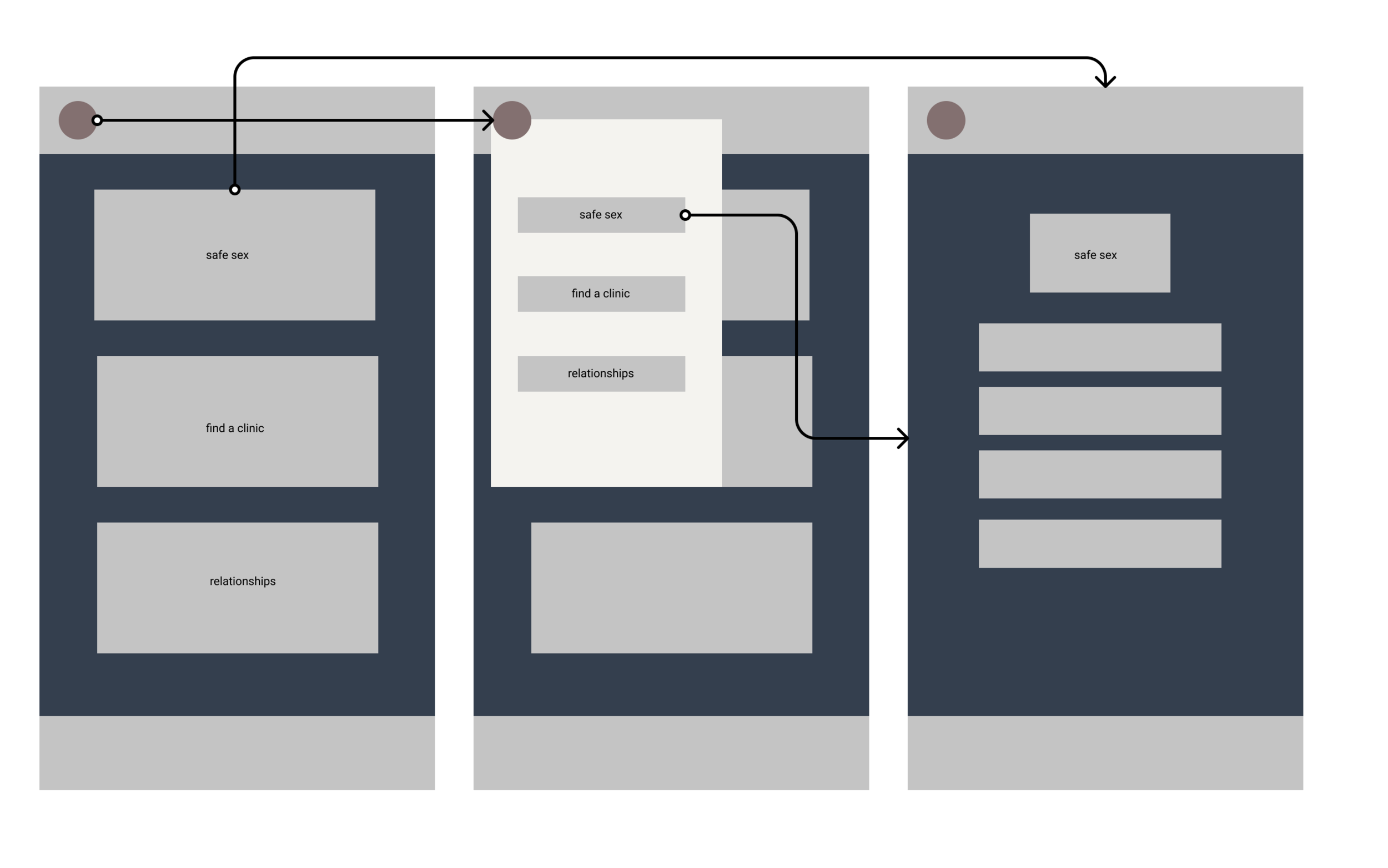
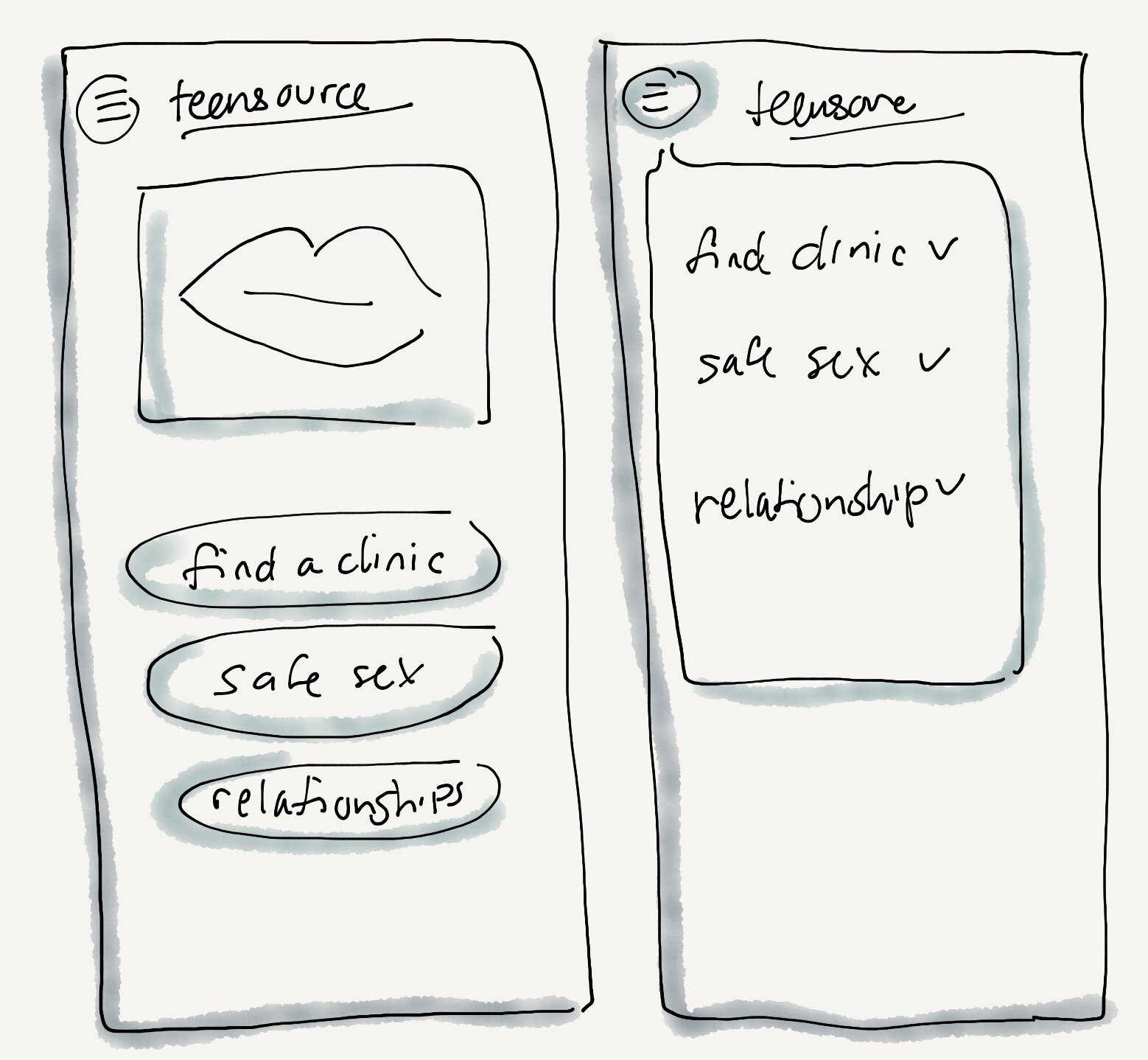
we did a round of user testing using a mid-fidelity prototype with the original three tasks. We got strong signal that our navigation was clear, with a few content design tweaks to the wording.
with our new simplistic nav, we began to think about the high fidelity, and making the statement we knew from research would be appropriate.

the final result
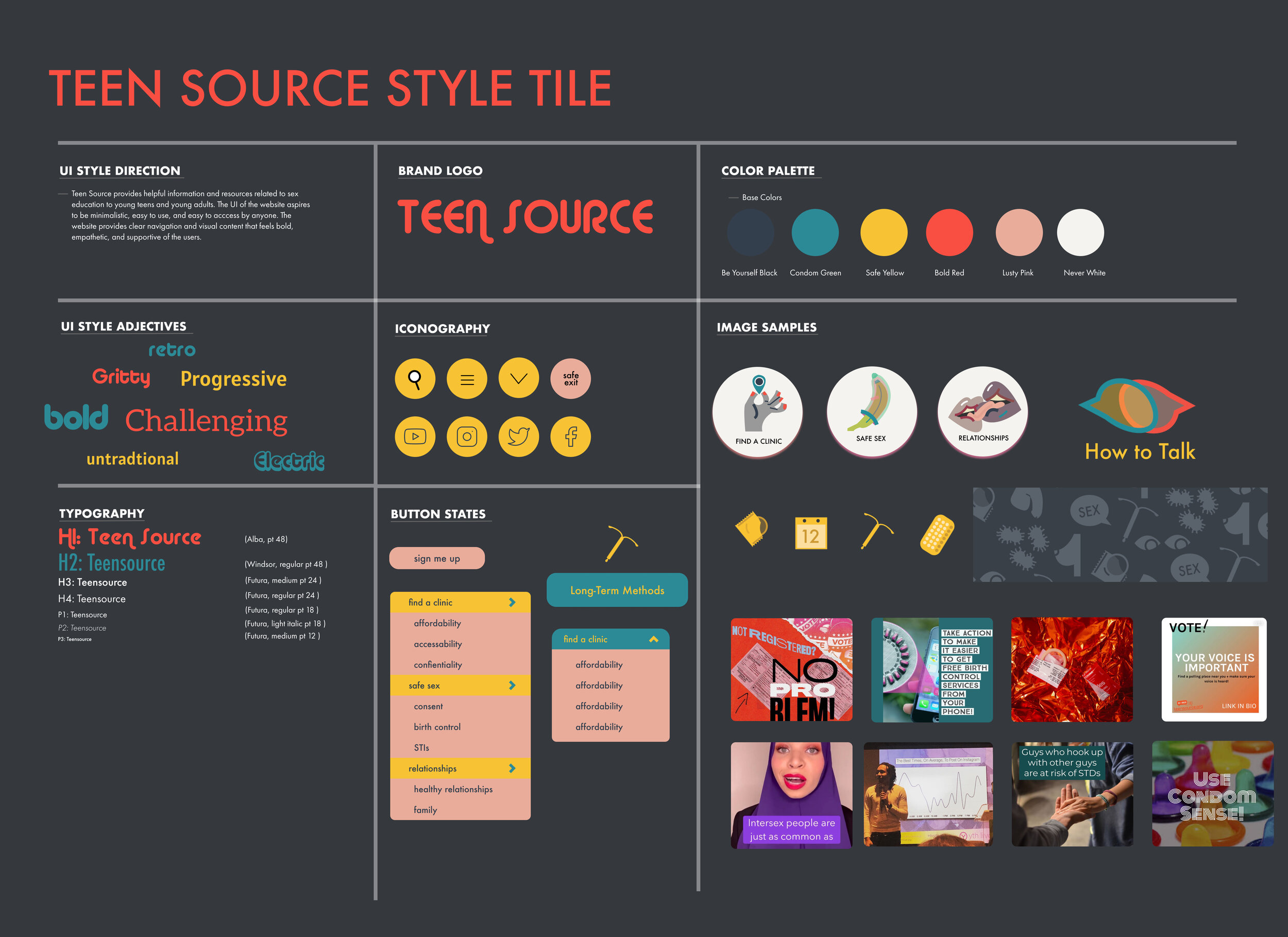
for our final style, we wanted to be extremely intentional in order to create a very cool website that would appear on brand with today’s teen generation. to do that, we looked backward in time, to design elements from the 1960’s that evoked protest, power, and grit.
luckily enough, one of our teammates was a talented illustrator, and she created illustrations to represent the mood of our website.
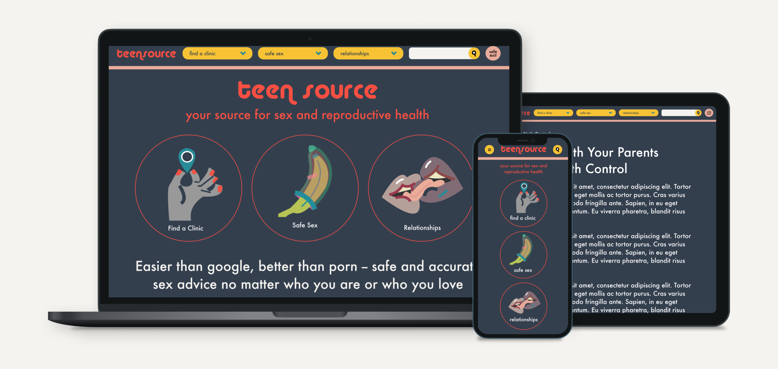
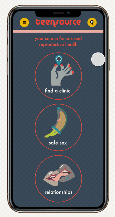
final mockups
next steps…..
If I were to take this one step further, I would want to double down on inclusivity. Sex ed is irrelevant to non-cis non-heterosexual people. why should they have to parse through this information on teensource? if we were able to establish enough user trust by establishing the data would only be used to filter the website, it would be interesting to explore if people would feel comfortable inputting their gender identity and sexual orientation to only see a version of the website applicable to their needs, ergo the most relevant information, right at their fingertips.